
ART DIRECTION + LaYOUT DESIGNHow do you modernize something that's been done by hand for a decade?
The Sock It to Me product catalog is the main sales tool for their organization, and it was outdated looking and not very functional. Retailers admitted to using the webstore to search the catalog instead of this selling tool that took many hours and resources to complete.
I began by creating a design system based off the brand style guide and streamlining page content. By enforcing a hierarchal organization, the content became well-ordered and easier to read. Once we were satisfied with how the content was organized, we improved product and lifestyle photography, and then were tasked with exporting all the data. All product information was placed in a database and exported into spreadsheets in order to automate the creation of future catalogs. This new design and process is far superior than chasing down information from multiple departments and designing everything by scratch.
The key-stakeholders wanted this selling tool to showcase the brand, and still wanted to keep fun and funky elements throughout. Below are spreads of the old catalog design, as you can see - there was a lot to improve on.


process
One of the first parts of the process had to do with designing new layouts. We needed various different templates for InDesign; establishing template elements like headers, page numbers, and section call-outs, pages for marketing purposes ( brand story, introducing season highlights etc.), and product grid pages. The thumbnails above are different options for some of the marketing sections, in most cases the creative direction had not been established before page layout was in development, so the design needed to be flexible and generalized.
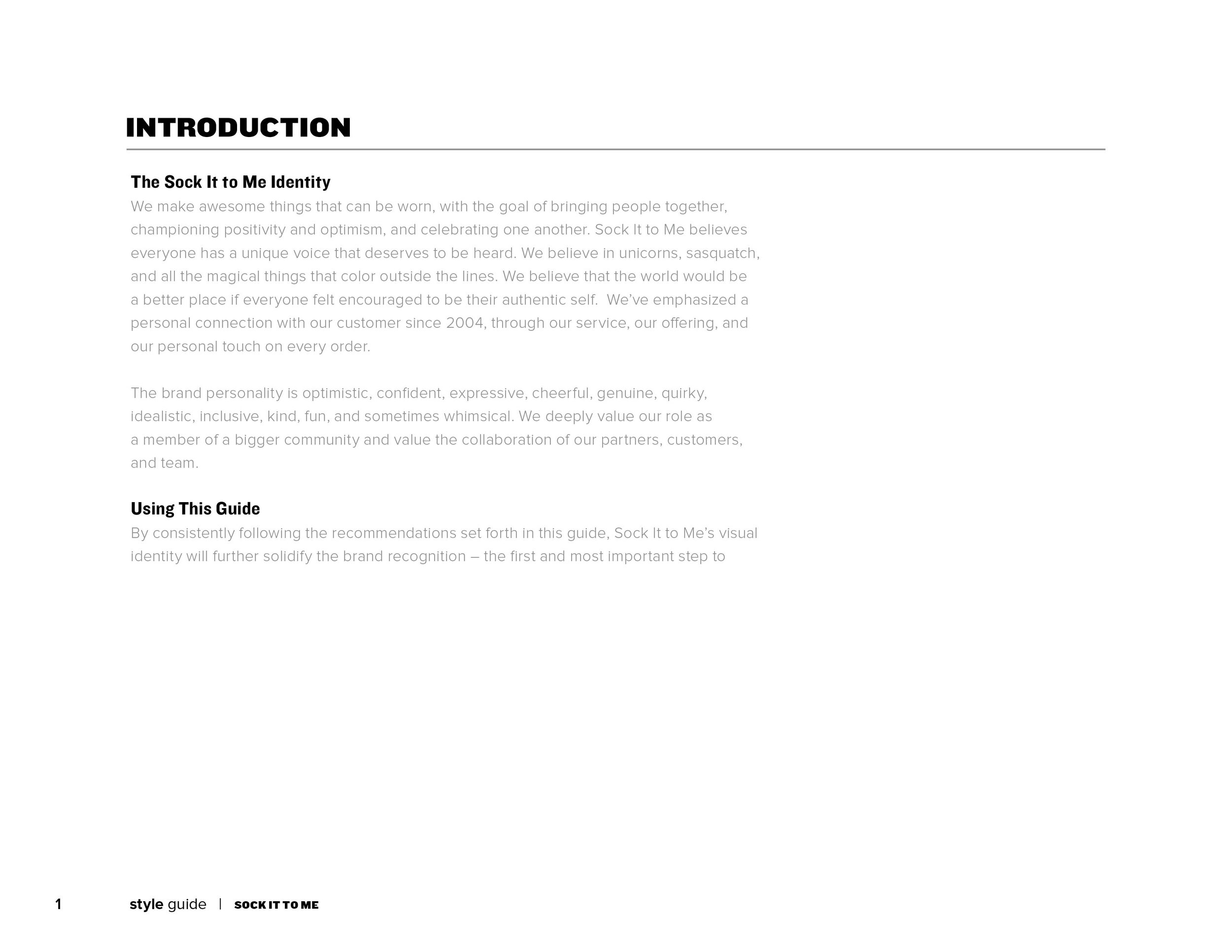
Then by taking a look at Sock It to Me’s style guide, I developed a color system for the catalog sections using the brand color palette. You can view some of the main pages of the style guide below. Much of the treatment used in prior catalogs did not come directly from the style guide, and I was able to drop poorly designed elements like the dot pattern overlay on header text with clear justification.


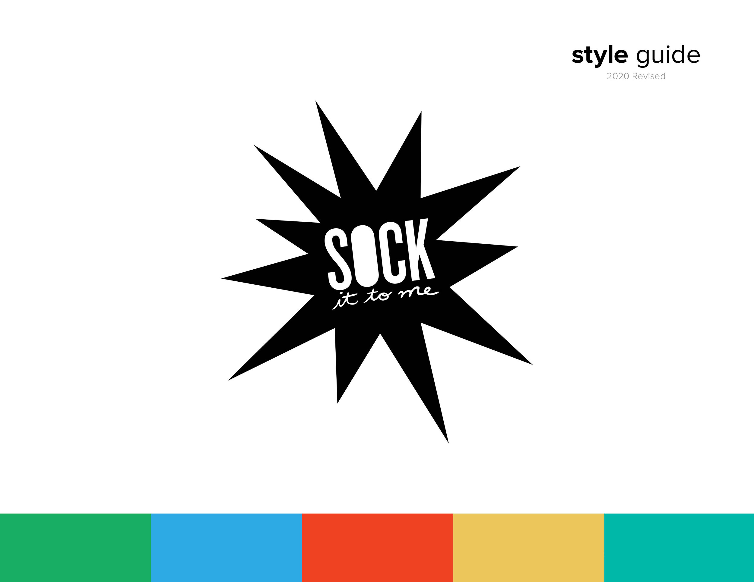
Here’s a list of some of the icons I created to identify different product types in the catalog, as well as the color signifiers used to define differing product sections. The color order was generally determined by the sales team, and which products led the catalog depending on the season, Spring or Fall.
RETHINKING
photograpy
This season’s product launch for Sock It to Me, drew inspiration from silly-awesome memes, throwback motifs, and playful, grown-up versions of action figures. The creative direction was relatively vague, so we leaned into the product design team’s inspiration, wanted a visual emphasis on the brand values, and added a dash of summer vibes.
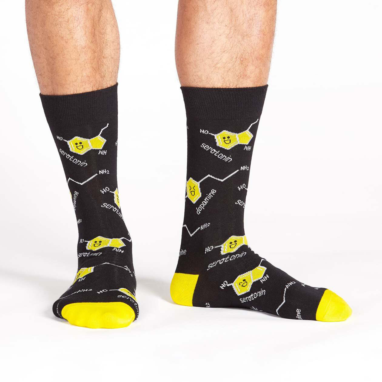
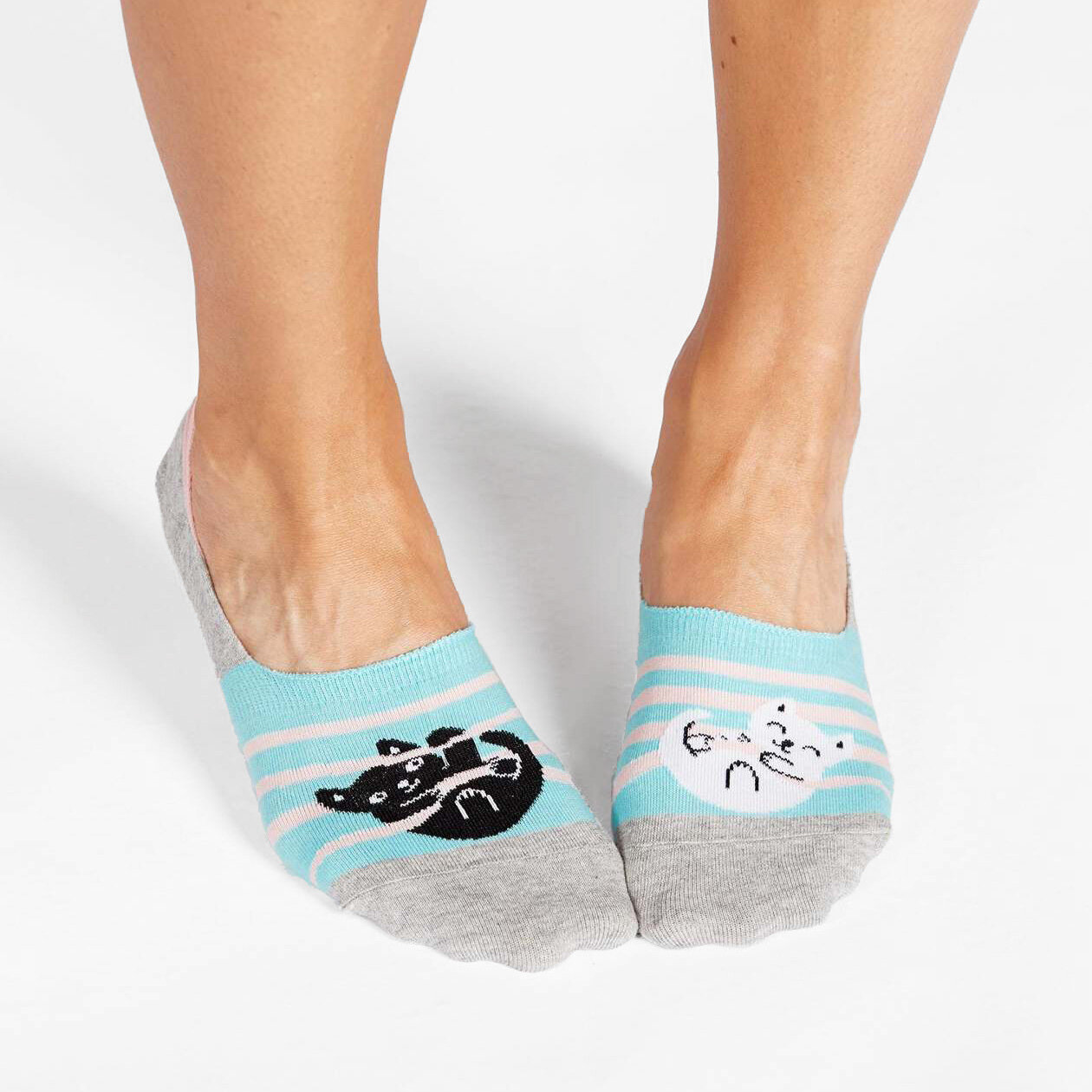
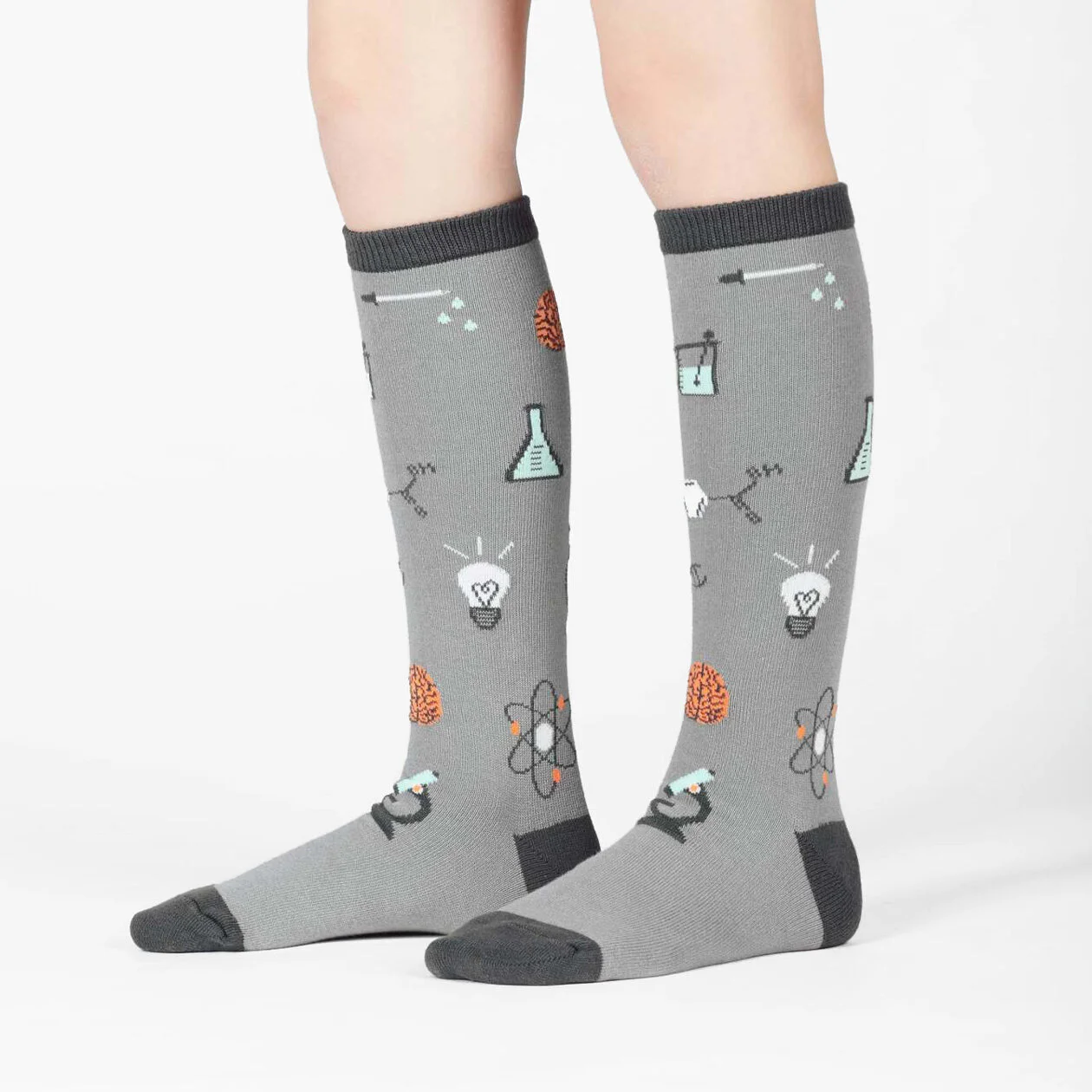
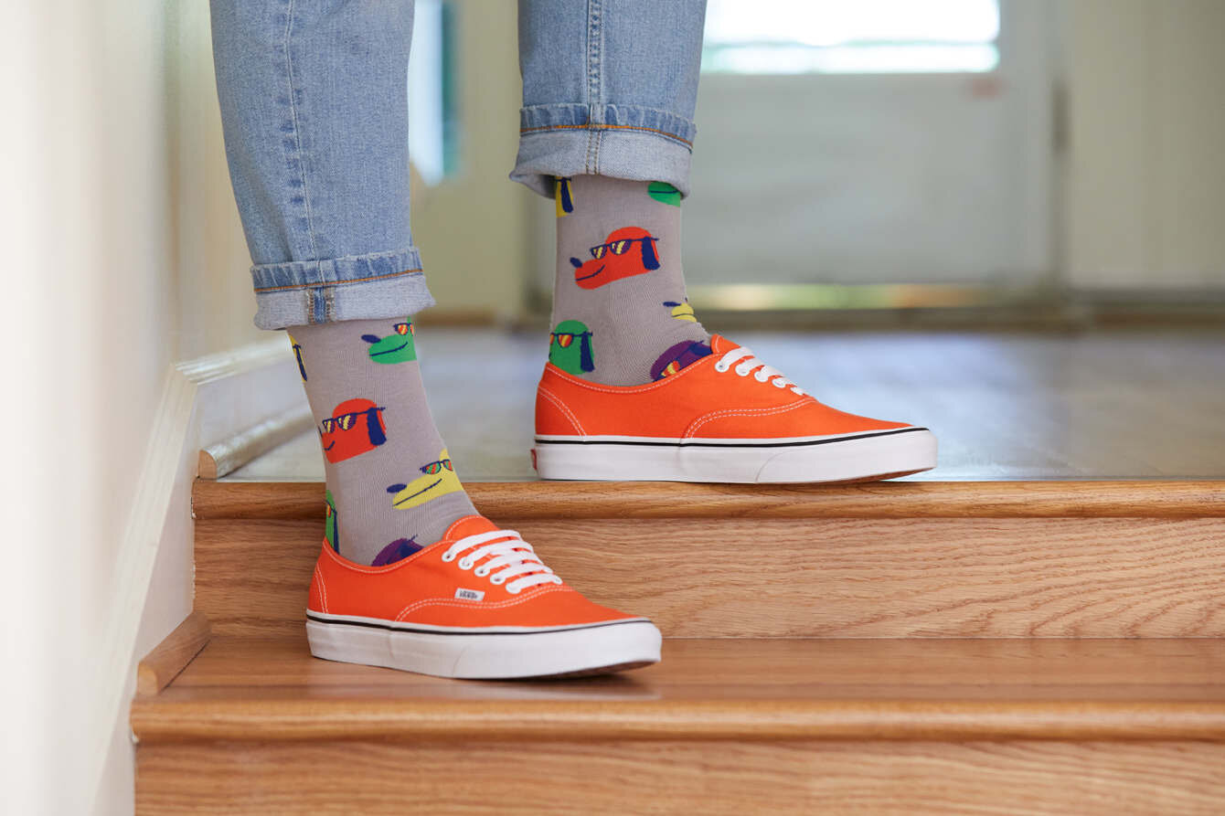
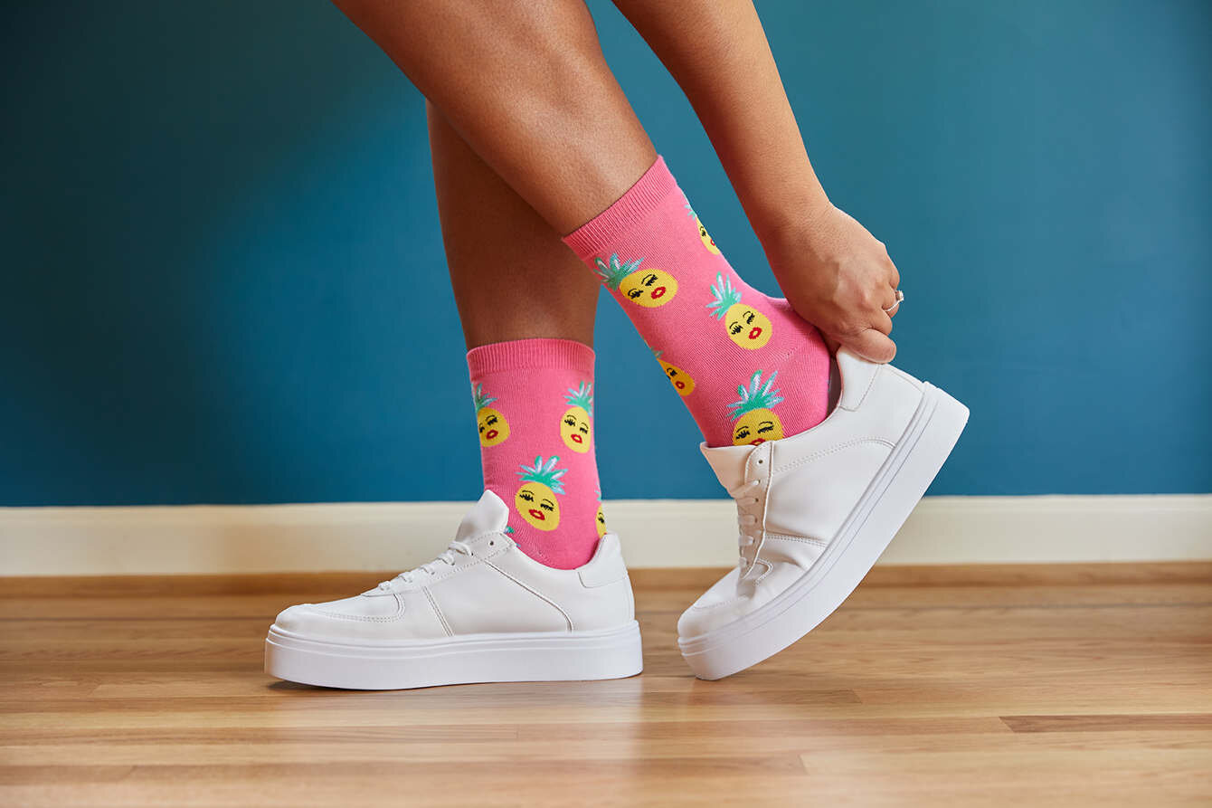
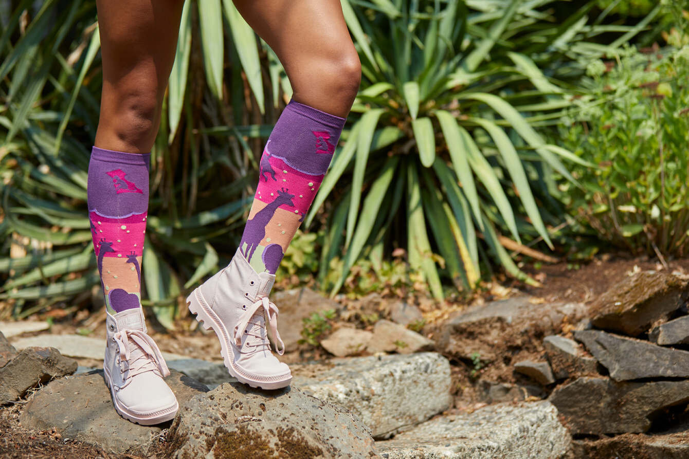
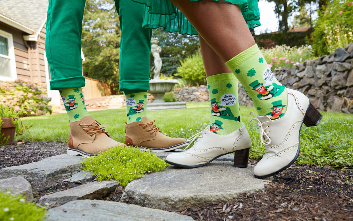
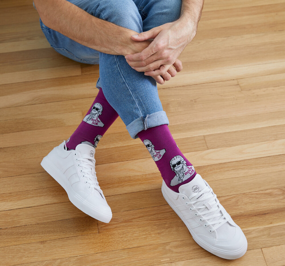
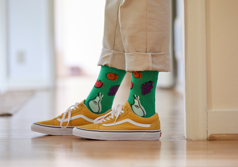
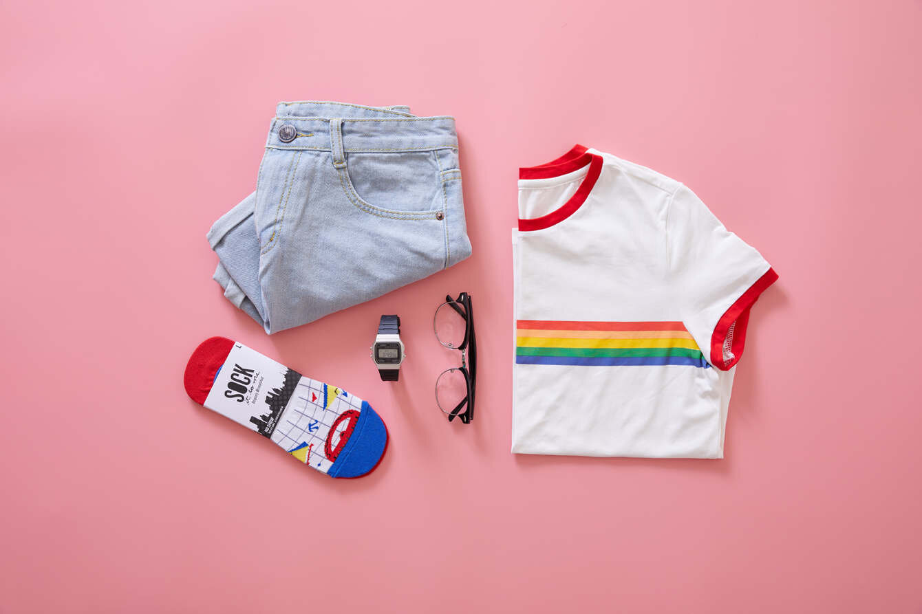
Past productions delivered assets meant to show how wearable the socks were, but felt busy and disconnected. So we scaled back distracting elements, like props and overly styled models, and cropped close in so the images centered around the socks themselves.
Key responsibilities for this stage of the project were: securing talent, holding fittings, creating shot lists and themes, art directing on set, and final edit of all photography. These images were also used in promotional campaigns, web banners, printed collateral, social media and e-commerce website for DTC and wholesale.







Final Catalog
The product and lifestyle assets are highlighted in a 60-120 page stock catalog, with hundreds of products and thousands of data source files. We successfully transformed an outdated and hard to use sales tool by creating clear hierarchy, embracing a grid, and highlighting eye catching photography. By reworking the process through every step, I was able to maintain consistency with the assets and final collateral and bring new life to the previously misused brand standards. Not only did we accomplish the needs for a new season product launch, but were we left with a design system that was applied to future product catalogs.
contributors
Laura Shea [Art Direction, Graphic Design, Photo Editing]
Alicia Reese [Art Direction, Styling]
Brian Lincoln [Lifestyle Photographer]
Jolie Goodson [Product Photographer]
Luke Clements [Photo Assistant]
SuperGreat [Producer]
Kat Audick [Styling]
for Sock It to Me.


